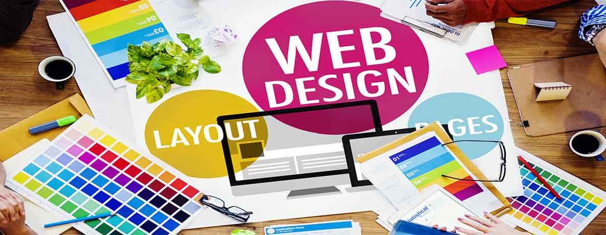
How an appealing Website design grab the attention of your users?
Website designing and development plays a very important role to strengthen your online presence. The theme, color scheme, contrast, content, and font play a very important role to grab the attention of users. Some websites are so grabby and eye-catching that they do not let you go off. Actually, it’s a fact that web design and the way our brain responds to some colors, and it surely can change our mood or way of thinking for the website.
Web design plays a critical role in attracting the customers. The purpose of your website is not only to deliver content but to provide in a way that it could click the viewer’s mind and to give the message and purpose of your website to the visitor. It is more like an image that explains itself to the audience without saying something. The professional web designer knows the secrets of attracting the minds.
It’s totally in your hand to make your visitor pleased by your work. Hire an excellent web design and development company who knows
• The effects of color psychology
• All those fundamentals that could make a mind positive or negative for a product
• The use if tools in the right way
• How to put efforts to make look everything real
• How to create a masterpiece of design that could seem appealing
There are Four major areas of a website that could affect the psychology of your visitor are explained below;
Content
Content is the main element on which your web design mostly depends. Your web designer would adjust the content and your design accordingly. If the user is unable to read the content or find the information he is looking for, then there is no useful purpose of this.
Space
Try to apportion a proper space to your content. If you have not assigned a proper space to your words and design, you may fail in providing your viewers a constructive feel. Allocate suitable space between the margins, boundaries, words and wherever it is needed.
White space
"White space” is a space exclusively assigned in the web design. No word, text or visual element is present there. It is kind of a resting place for the eyes who are visiting your site. You could find them in the margins or might be around your products or things that you have designed.
Color
There is a basic trend of using the colors of the association, company or brand in the making of their official website. But the main approach here is, to use correct affects and shades. An inexpert web designer would never be able of creating shadows in a right direction. Neutral colors are the supportive colors that act as the support of your main colors. People use tints, shades or hues of standard neutral colors like gray, white and black to give an overall best look.
Typography
Typography is selection of fonts for your website. Now there are thousands of fonts to select the smoothest, professional, informational and readable fonts to deliver information and to attract the visitors. Your fonts are important for the users as well. Always try to select a medium font size. With the help of these main four elements, i.e. content, space, color and typography; one can create a perfect web design.


Comments